
A project by Yoo Jeong Yoon
The datasets that show the danger of smoking were collected from online sources. The collected datasets were then visualized in the form of graphs: line graph and donut graph. Based on the graph, an artefact was created that interprets the results from the graph.
Data
The donut graph shows the number of deaths by risk factor in 2017. The Line graph shows the cigarette consumption and lung cancer death rate in the US from 1900 to 2010.
Artefact
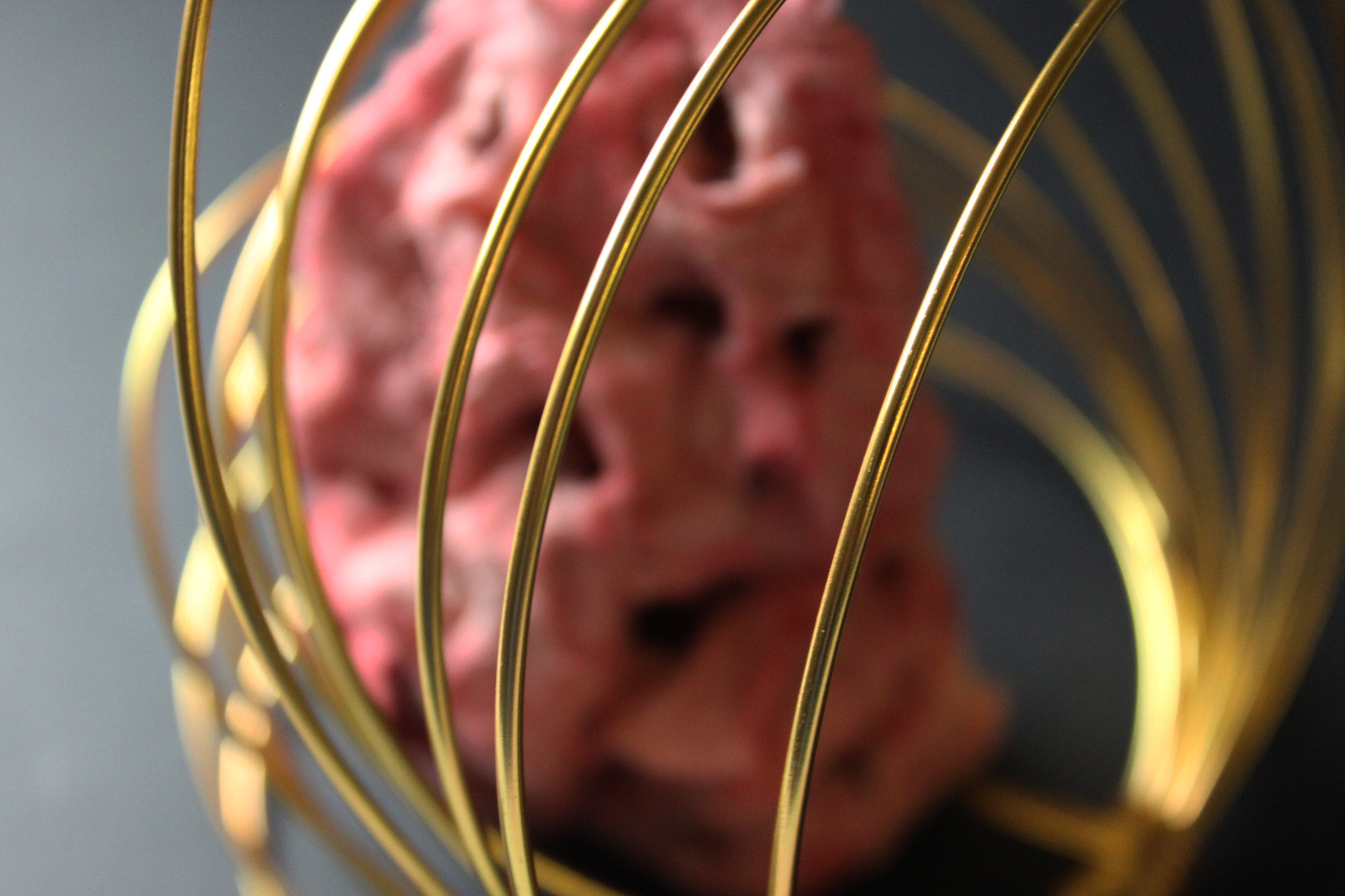
The artefact is based on the line graph which shows the connection between cigarette and lung cancer. The damaged lung with a lot of holes communicates well about the danger of smoking.