The World Health Organization's tobacco use statistics indicate that approximately 7 billion worldwide people die smoking-related deaths every year.
Introduction
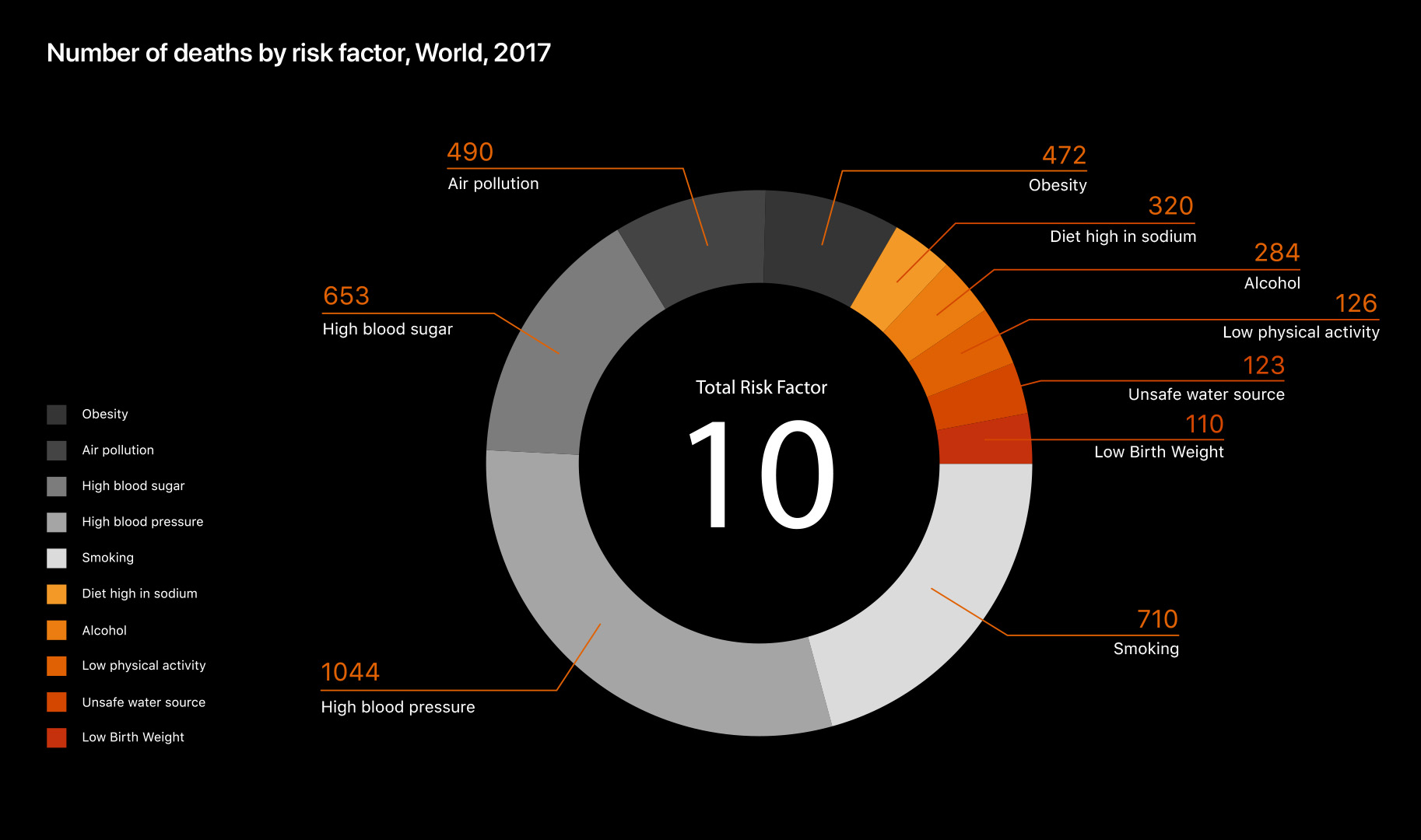
The donut graph shows the number of deaths by risk factor in 2017.
The design of the graph represents burning cigarettes. It is divided into monochrome which expresses the body of the cigarette and reddish color which expresses the combustion of the cigarette.
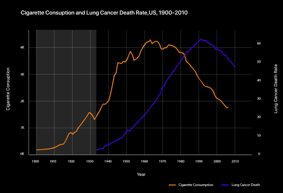
The line graph shows the cigarette consumption and lung cancer death rate in the US from 1900 to 2010. The cigarette consumption and lung cancer death rate are also classified by vivid colours.
Data Visualisation
A donut graph can display multiple data sets compared to pie charts which is used when the number of data sets is small, around 6 or less. As my data sets contain more than 6 which is 10, I used the donut graph.
Donut graph is also good to use when comparing sets of data using various colours.
It is decided to use the lightest gray for the colour of smoking for the readability.
The hole in the middle of this chart doesn't exist for no reason. It is used to convey extra or additional information, so I included the total number of risk factors.
Line graph works well in showing trends chronologically and helps to determine the relationship between two sets of values. Therefore, I used the line graph to show the correlation between smoking and the development of lung cancers between the time from 1900 to 2010. Without comparing them with 2 respective line graphs, 2 data sets combined in one line graph shows the relation more clearly.

Findings
High blood pressure, smoking, high blood sugar, obesity, and air pollution accounts for a large proportion among all the factors in the donut graph. Smoking is the second highest followed by high blood pressure.
In the line graph, X-axis represents the year from 1900 to 2010. The Y-axis on the left represents the cigarette consumption and the Y-axis on the right represents the lung cancer death rate. Cigarette consumption increased in 1900 and began to decline in 1960. Lung cancer death rate starts from 1930. It rose steadily compared to cigarette consumption and then began to decline in 1990.

Insights
In the donut graph, smoking is second highest among the 10 risk factors. This shows that smoking is the main cause that leads to death.
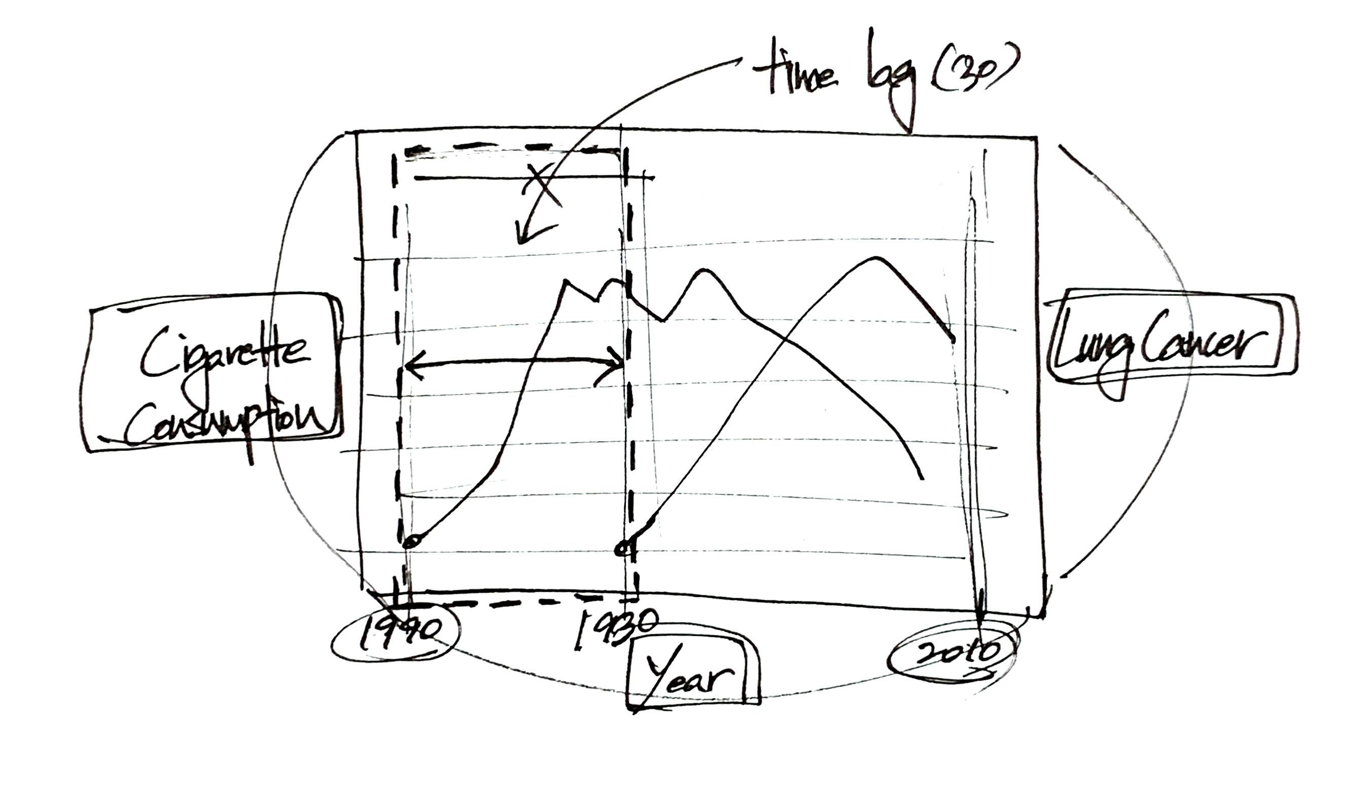
In the line graph, the cigarette consumption starts from 1900 and lung cancer death rate starts from almost 1930. The cigarette consumption was rated highest in 1964 and lung cancer death rate was highest in 1992. The curves have a similar slope with a 30 years time lag. This shows that lung cancer appears 30 years after smoking and eventually leads to death.


Conclusion
Both graphs are created to convey dangers of smoking.
The donut graph shows how harmful cigarettes are by showing that cigarettes account for the second highest percentage of the factors that lead people to death.
The line graph shows one of the causes of why cigarettes took second place in the donut graph. By comparing cigarette consumption and lung cancer death rate, we can know that smoking causes lung cancer. Lung cancer caused by smoking eventually leads to death in the next few decades.